Color Palettes for the Outdoors: Harmonizing Aesthetics With Nature’s HuesColor Palettes for the Outdoors: Harmonizing Aesthetics With Nature’s Hues
When we venture into the great outdoors, we’re surrounded by nature’s exquisite tapestry. A vivid symphony of colors that captivate the eye and stir the soul. From the serene blues of a clear sky to the vibrant greens of lush foliage and the warm hues of a sunset, the natural world offers an endless palette of inspiration for beautifying our outdoor spaces. According to BusyBuildingThings, creating an outdoor ambiance that harmonizes with nature’s hues involves more than just picking a few colors. It’s an art that integrates the environment’s natural colors seamlessly with our design choices, enhancing the overall aesthetics and fostering a connection with the surroundings.
Embracing Tranquil Blues and Greens
Blues and greens dominate the natural landscape, representing the sky, water bodies, and lush vegetation. Incorporating these calming hues into your outdoor space can evoke a sense of tranquility. Opt for shades like azure, sky blue, or seafoam green for furniture, cushions, or even as accent colors on walls or accessories.
Understanding Nature’s Palette
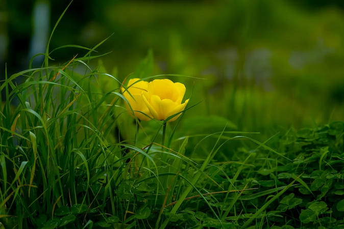
Nature’s color palette is a wondrous blend of subtle and striking hues. Take a moment to observe the environment around you. Notice the soft pastels of a sunrise or the deep, earthy tones of a forest. Each landscape, season, and time of day brings forth a unique set of colors, presenting a wealth of inspiration for outdoor design.
Considering Earth Tones for Warmth
Earth tones ranging from sandy beiges to rich browns mimic the colors found in soil, rocks, and trees. These warm hues create a grounded and inviting atmosphere. Consider using terracotta pots, wooden furniture, or warm-toned textiles to infuse your outdoor area with the cozy embrace of nature.
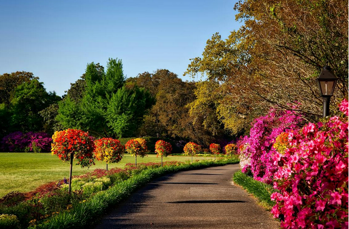
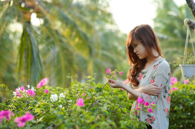
Accentuating With Natural Pops of Color
Nature doesn’t shy away from vibrant pops of color, and neither should your outdoor space. Flowers, fruits, and even certain wildlife offer bursts of reds, yellows, purples, and oranges. Integrate these bright accents strategically with a splash of crimson in your throw pillows or a touch of golden yellow in your garden decor to enliven the ambiance without overpowering the natural surroundings. One of the joys of nature’s palette is its seasonal variability. Embrace this by adapting your outdoor color scheme to the changing seasons. In spring, consider pastel shades and fresh greens. Transition to deeper tones in fall, like burnt oranges and deep reds, echoing the colors of falling leaves. This adaptation keeps your outdoor space in harmony with the evolving natural beauty around it.
Incorporating nature’s color palette into your outdoor design isn’t just about aesthetics. It’s about embracing the beauty that surrounds us. By integrating tranquil blues, earthy tones, and natural accents and adapting to seasonal shifts, you can create an outdoor space that not only looks appealing but also resonates with the serene and vibrant colors of the natural world. Let nature guide your color choices, and watch as your outdoor haven comes alive in perfect harmony with its surroundings.…